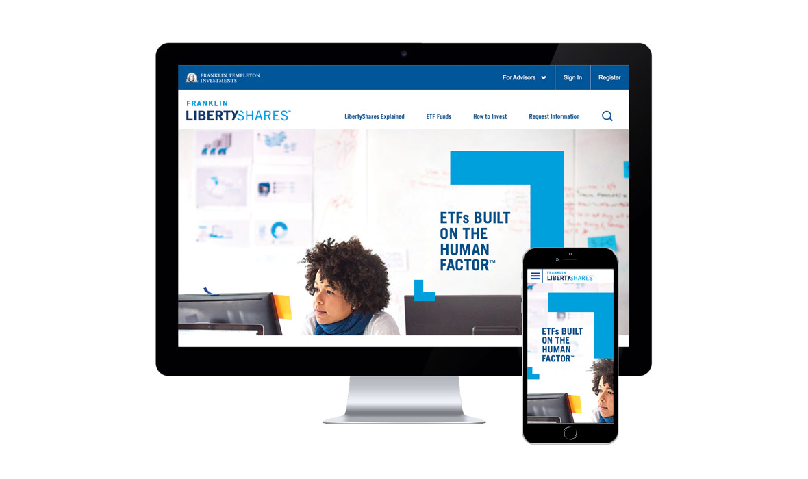
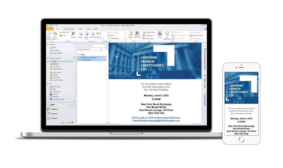
We offered multiple studies, exploring different ways of connecting LibertyShares to the parent brand. Once the decision was made to market it as a separate brand that is still connected to Franklin Templeton, our team created three options for the design system. For my option, I decided that the Franklin Templeton’s “arrow cursors” could be a good connection to the parent brand without being too overt. As I sketched, I applied the “push/pull” design theory with small and large arrow cursors used as framing devices bracketing the headline.
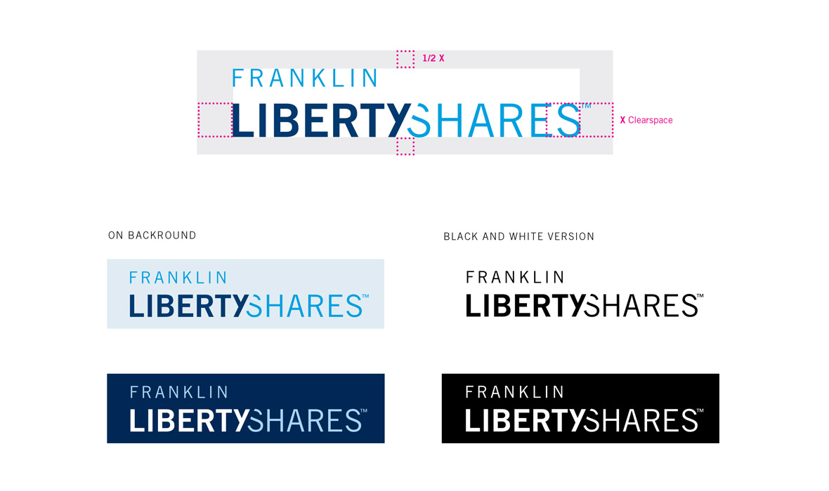
My LibertyShares wordmark clearly fits within the new system’s lexicon. In order to communicate the technical trades possible with ETFs, the two words are "trading" space through the diagonal line created by the Y. This connection creates a feeling of motion between the two words, it feels as if “Shares” has slid right into place. Extending the metaphor further, “Shares” can be seen as a verb rather than a noun, with the overlapping letterforms sharing the combined space.